Take a look around. Notice anything different?
As we mark 30 years of commitment to our customers, we unveil today a new, modernized brand for PCI Energy Solutions.
You could look at this as a simple wardrobe change, but for us, there’s much more to it than that. This new brand shifts our visual identity to align with the professionalism and rigor with which we approach our work, and further clarifies and cements the foundations of our company.
And, if I might add, it makes our website and blog, our social media posts, and the rest of our company assets look darn good.
Read on to learn the details of our new brand, from our revamped mission and vision to our new logo and colors. Plus, you’ll want to know about how this rebrand affects you — whether you’re a PCI customer or interested in becoming one.
From Power Costs, Inc. (PCI), to PCI Energy Solutions
One of the biggest feats a company can undertake in a rebrand is a full name change. It’s a tall hurdle, but one worth clearing for us.
We’ve modified our company name from Power Costs, Inc., (PCI), to PCI Energy Solutions, signifying that we have been and continue to be much more than a company focused on reducing costs for power generators. Our reworked mission underscores that: “We empower energy companies to continuously optimize all aspects of energy production, trading, transportation, and consumption” — and that includes electricity, water, and natural gas.
“We knew we needed to make a definitive break from our Power Costs Inc. name and domain because we’ve been known as both PCI and Power Costs Inc., so we searched high and low for a name that would retain the brand equity we’ve created as PCI, be ownable by us in a way that ‘PCI’ on its own is not, and be true to who we are now and who we will be for the future. We think PCI Energy Solutions fits the bill perfectly.”
David Christopher, senior director of Marketing Tweet
Along with a new company name comes a new web domain and fully redesigned and rewritten website at pcienergysolutions.com, allowing for more intuitive navigation and better understanding for visitors about what PCI is, the software solutions we provide, and the value we bring to our clients’ operations as well as to the overall energy industry.
“Not only does this rebrand modernize the visual identity of our company with a new website, logos, and color scheme that reflect our mission and company values, but it also helps convey what we already knew: that PCI is poised to match the pace of an industry in constant transformation.”
Javier Martin, PCI president and COO Tweet
And of course, our email address domain names will eventually change as well (we’ll alert you when they do). Before you might have emailed [email protected], for instance. And now, you’d email [email protected]. Rest assured if you don’t get it right, your email to any @powercosts.com email address will redirect to the correct inbox. Typing any powercosts.com URL into your search bar will also redirect to our new corresponding pages.
PCI logo and color scheme
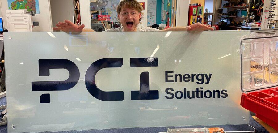
In June, I had the privilege of unveiling the new PCI logo to our company of more than 300 employees at our quarterly all-hands meeting. After a makeshift drumroll of hands eagerly thwapping on laps inside our Norman, Oklahoma, office, our new logo flashed on the screen and our in-office employees clapped and cheered. Sounded like a homerun to me!
As a marketer, it’s always been interesting to me to know the design choices behind logos. And we’re fortunate at PCI to have built a logo with thought and intention. Our new logo is intended to communicate our brand as wise, diligent, and pragmatic (our three brand pillars). It symbolizes PCI guiding our customers through their customer journey. The new design is focused on creating flow, movement, and dimension within the mark.
The P demonstrates the journey and provides an entry point. The C creates flow and connection. The capital I is strong and grounded, with the cap providing balance and dimension.
Now onto the colors. The blues and greens convey that we’re established and reliable, while the orange accent encourages motivation and embraces modernity. Frankly, I can’t wait to see our employees and customers donning PCI T-shirts in azure or jade or carrying around our new swag in midnight blue with pops of mint and orange. It’s certainly a color palette to wear with pride.
PCI brand foundations
You can think of brand foundations as the building blocks that make up a strong brand. We’ve already covered our brand pillars and brand mission, but a few more elements make up the whole package.
- Brand positioning: This is the place a brand occupies in the minds of the customers and how the brand is distinguished from the products of the competitors. Our positioning is: “PCI Energy Solutions is a time-tested partner to energy companies in optimizing their operations through end-to-end, scalable software solutions. We implement our solutions through coordinated, expert support to guarantee long-term customer success.”
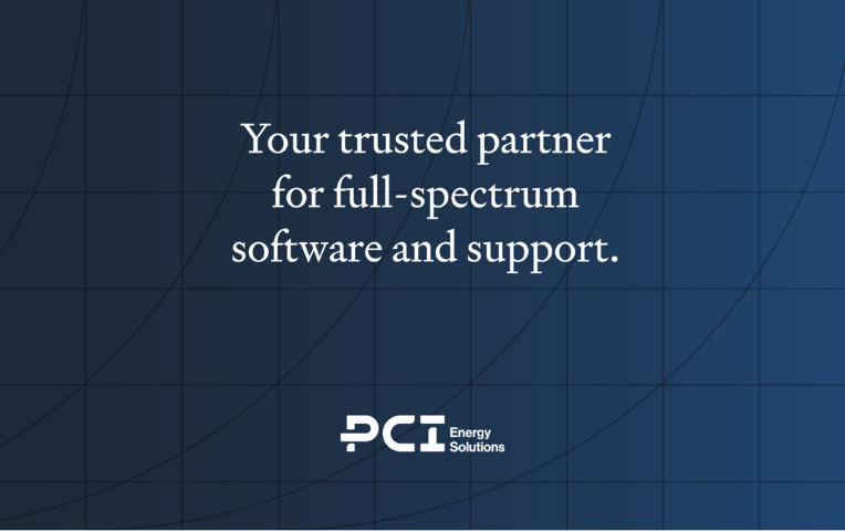
- Brand promise: This is the hook. The brand promise is a simple, straightforward, and memorable phrase that communicates what you can expect from us. Ours is: “Your trusted partner for full-spectrum software and support.”
- Brand vision: Brand vision is like going into a job interview and being asked, “Where do you see yourself in five years?” It’s our distant mountain. It’s where we’re headed. Now what’s ours? “PCI creates software solutions that are an integral part of our customers’ success, helping them achieve a more reliable, affordable, and cleaner energy future. By doing this we believe we’ll become an iconic company in the industry.”
- Brand values: These speak to the character, ethics, and integrity of our brand. This concept should be pretty familiar to anyone who’s read our blog post on our company values (hint: they’re the same as our brand values). Those are: customer success, continuous improvement, enlightened awareness, and connectedness.
Seeing the new brand in action
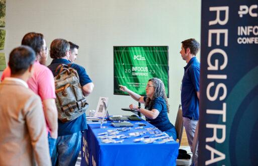
We quietly unveiled our new website and started rolling out the rest of our updated assets today. But come Sept. 12, INFOCUS Conference 2022 attendees will be the first to see the new brand truly in action. When you walk into the Omni Hotel in San Diego for our annual user conference, you’ll see what I mean.
Javier, for one, is ready to get this new brand in front of you.
“Part of what makes this rebrand so exciting for us is knowing we’re on the cusp of our annual user conference, where our customers will get to see the reimagined brand in action for the first time and celebrate our 30 years in business,” he said.
“When we kick off the conference on Sept. 12, we hope our customers are as delighted with the changes as we are and see this new brand as a true reflection of PCI and our employees.”
You already know we’re pretty keen on it, but we’d love to know what you think of the new look. Head to our LinkedIn page and join the conversation on today’s post.